After expanding to New Orleans (and working more regularly with destination clients) I began having to rely quite a bit on phone, skype and email to communicate with my clients.
I was nervous when I transitioned out of in-person meetings; I was scared we wouldn’t develop the relationship that I so valued. And I was concerned this would negatively impact clients’ experience and my business.
Fortunately, developing this system of professional product images and detailed product descriptions (accompanied by a phone call or Skype meeting on occasion) has allowed my clients to continue receiving the level of customer service they need and my business to continue growing!
The challenge here is to keep the same level of communication without having the comfort and security of meeting one-on-one. Especially when it comes to selling products, I am faced with the greatest challenge: How can I show and explain something tangible that they cannot see and touch?!
And so…I communicate the value of my products using:
1.PROFESSIONAL PRODUCT IMAGES
2.DETAILED PRODUCT DESCRIPTIONS
In order to do each of these successfully, there are a few things that need to be considered and executed. So, let’s start first with the product images:
1. PROFESSIONAL PRODUCT IMAGES
Good Light:
When I’m styling products to be photographed the first thing I’m looking for is lots of beautiful, natural light! This means that there are no strong color casts but only daylight in its purest form. You can find this light most often in shady areas (as long as it’s evenly lit) or by using window light and reflectors (whether natural or not).
This image below was taken adjacent to a window. And all the walls near and around the window are white (reflecting evenly onto the product.)

Simple Styling:
I always photograph products on a simple backdrop. In most situations, I’ll lay products on a white foam core board (this can be found at hobby lobby); but every now and then I’ll shoot on my concrete floors or a light colored wood.
Also, I’ll often incorporate small objects into the image. Not only does this give the product scale but also personality and style. Ribbon is an excellent addition as are household objects that imply a specific aesthetic and add color (examples may be pens, pencils, stamps, clips, etc).
Lastly, composition is key. You want your images to focus on the product but also incorporate those same rules of composition and interest that you use when photographing people.

Variety:
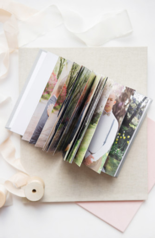
Just like when viewing a product in person, you want the client to be able to view the product from a variety of perspectives. For example, maybe they’ll want to see how the product looks from the top, when opened, and also the thickness of the pages. Sometimes…I’ll even place another product in the image for comparison!
Below are a few examples of how I show off my books. I want my clients to see how beautiful the these products are and how the layouts inside look as well! <3

2. DETAILED PRODUCT DESCRIPTIONS
Although technically you should approach the photographs as if there are no words to pair it with…having a way to display a written description of the product you’re selling is just as imperative.
I use my blog as the platform in which clients view these product descriptions. I include links in the email with my pricing for them to review products. But of course…formatting is up to you!
A few things that aren’t to be compromised are:
CLARITY:
Write the description as clear and concise as possible. When clients are looking to make a purchase, they’re reviewing a lot of information! Keeping thoughts brief and easy to understand will really make things smooth for them. The easier the decision the quicker the purchase.
Include specifics such as fabric descriptions, measurements and what is/isn’t included in the product. Try to think of every possible important detail…and put it into words!

PROOFREAD:
This should go without saying but anytime you’re writing something that a client will read, have someone read over it, too. Or just read over it again and again yourself.
I always read my posts aloud before making them live. Every extension of your brand should be professional, even your written words.

CONVERSATIONAL:
Make the text conversational…even try referencing context in which they can use the products! For example: “Sometimes my clients use engagement session books as guest books.” or “Clients will often display their bridal books at the reception and later on coffee tables in their homes.” So, I’ll outline these tips in the text. I want them to visualize how their products can be used.
Pretend you are the client. What things would you want to know? What questions would you have?
And over time, listen to your clients. If they’re asking the same questions over and over, maybe you should add more images or clarify your text a bit!

Just like any aspect of business, it’s a learning process of making mistakes and figuring out what works for you!
For any questions specific to this concept of selling without a studio feel free comment on the post or email: catherine@catherineguidry.com 🙂
Best of luck!
